Stopanska Banka Logos
Download Logos
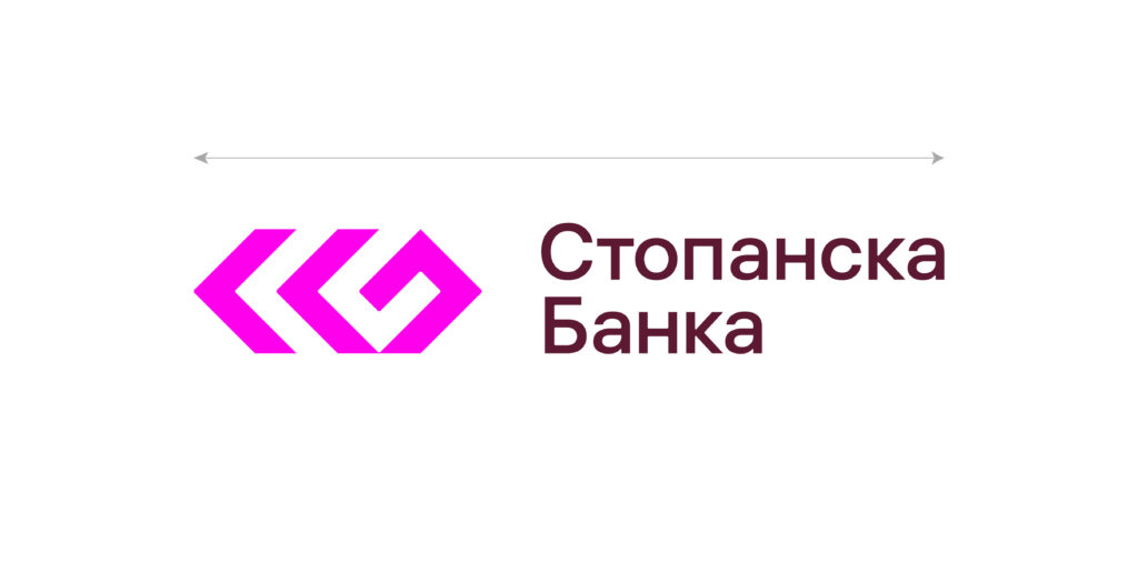
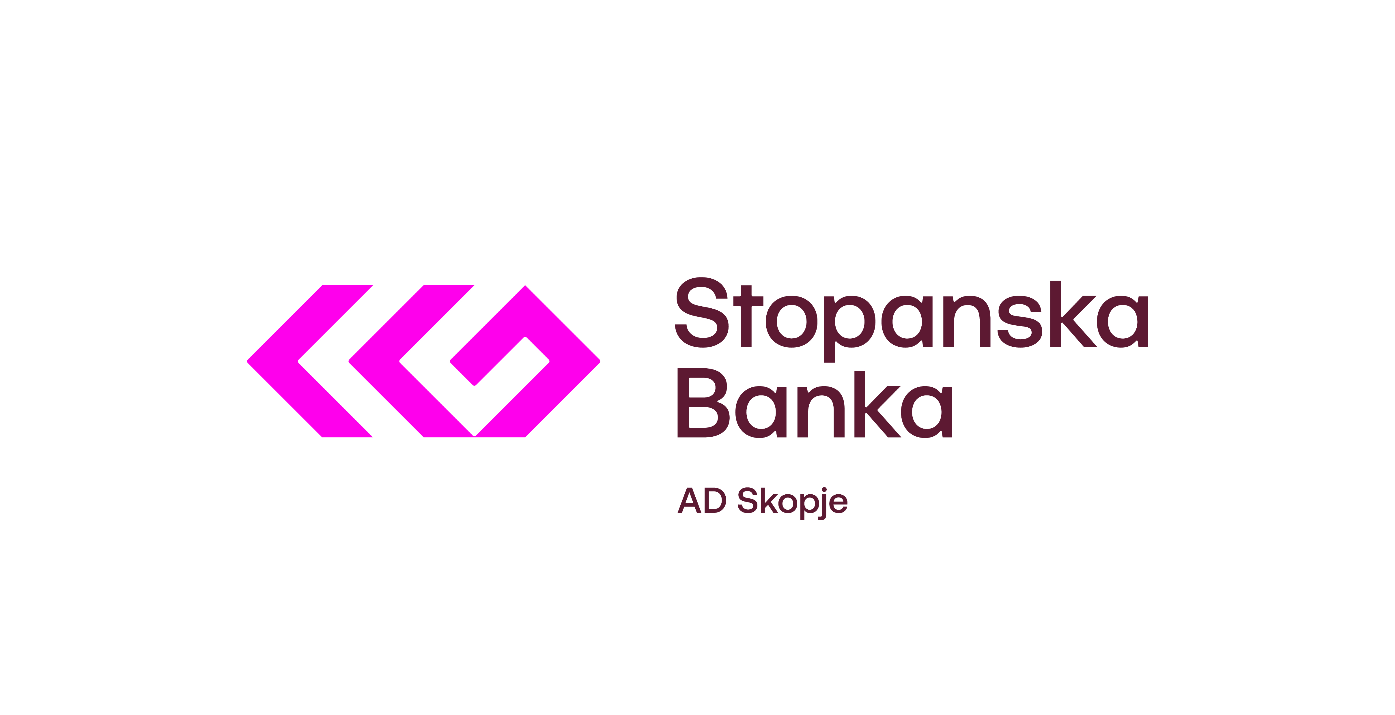
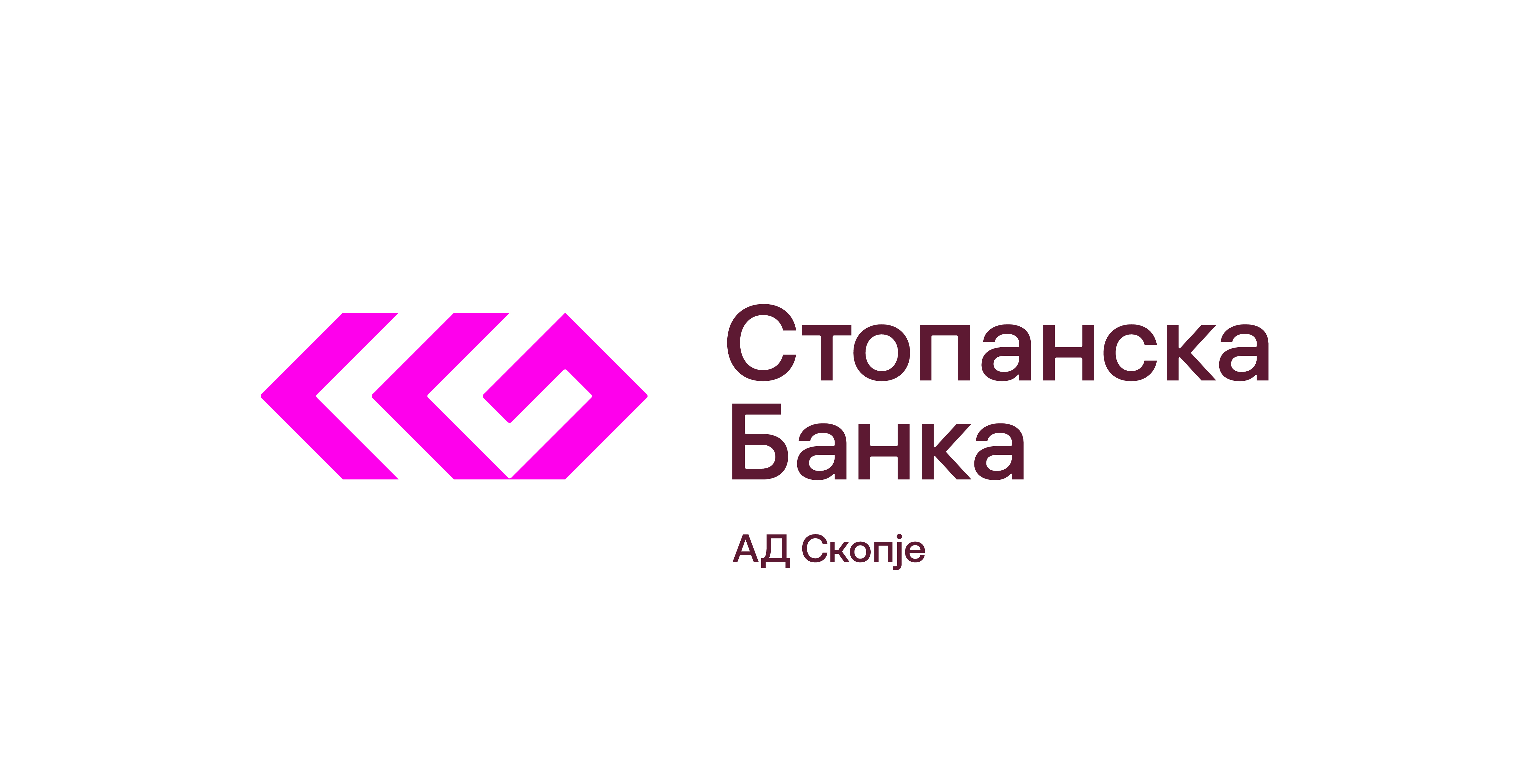
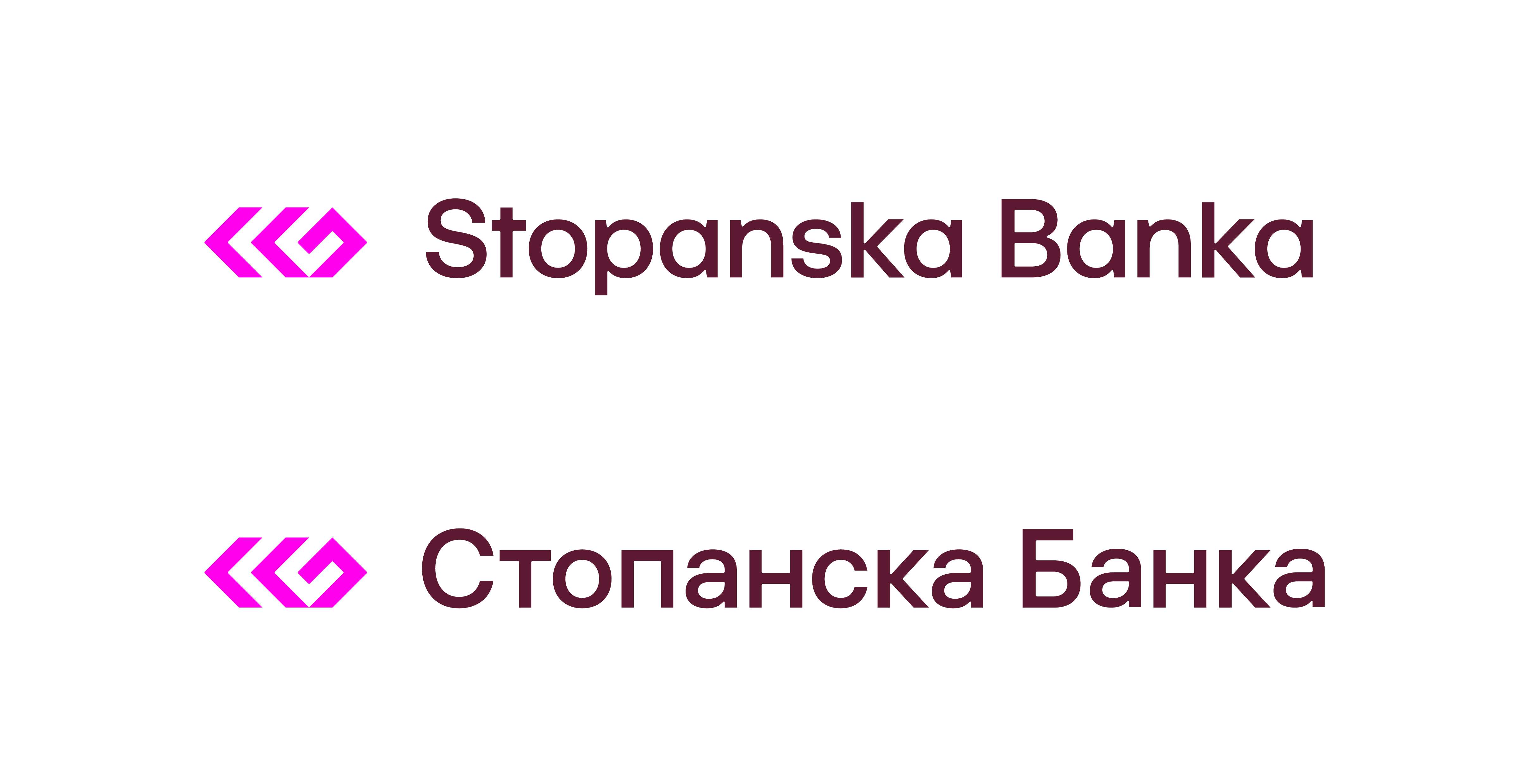
Stopanska Banka Main Logotype

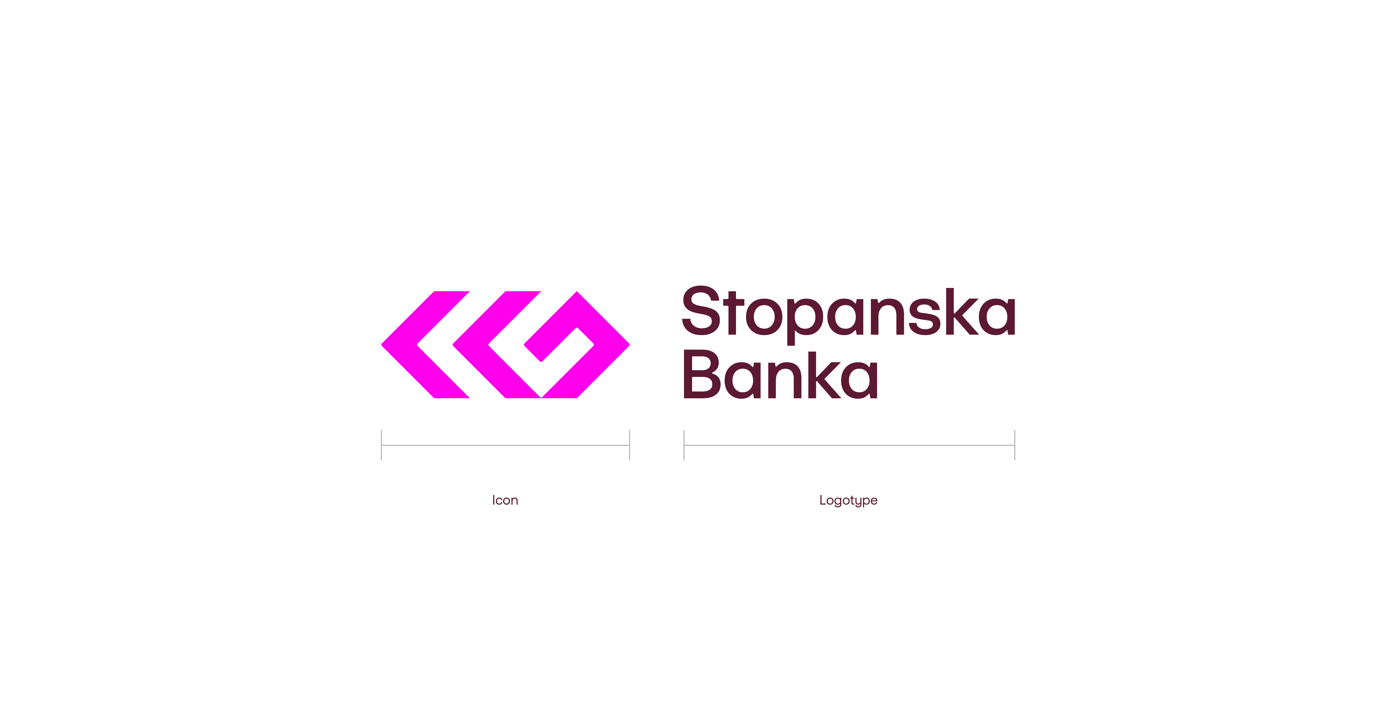
Versions

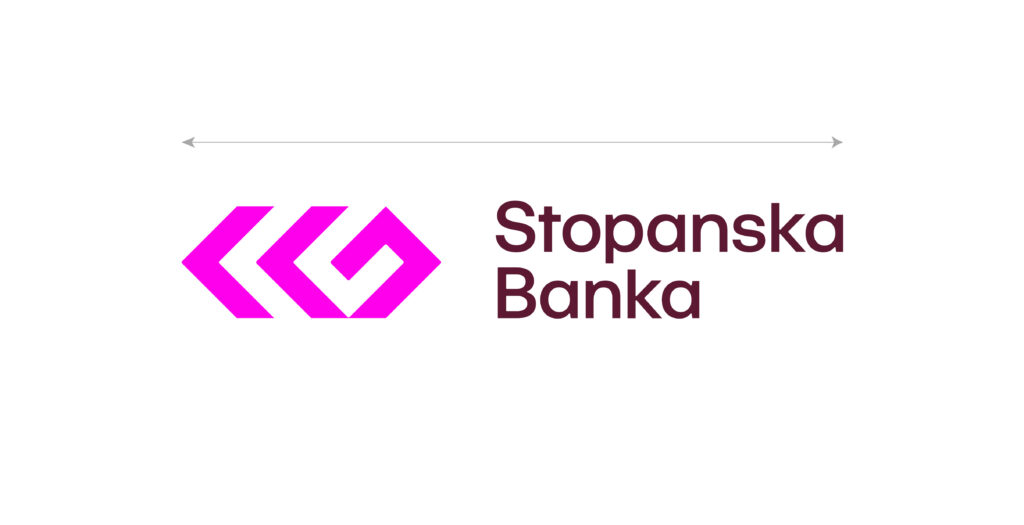
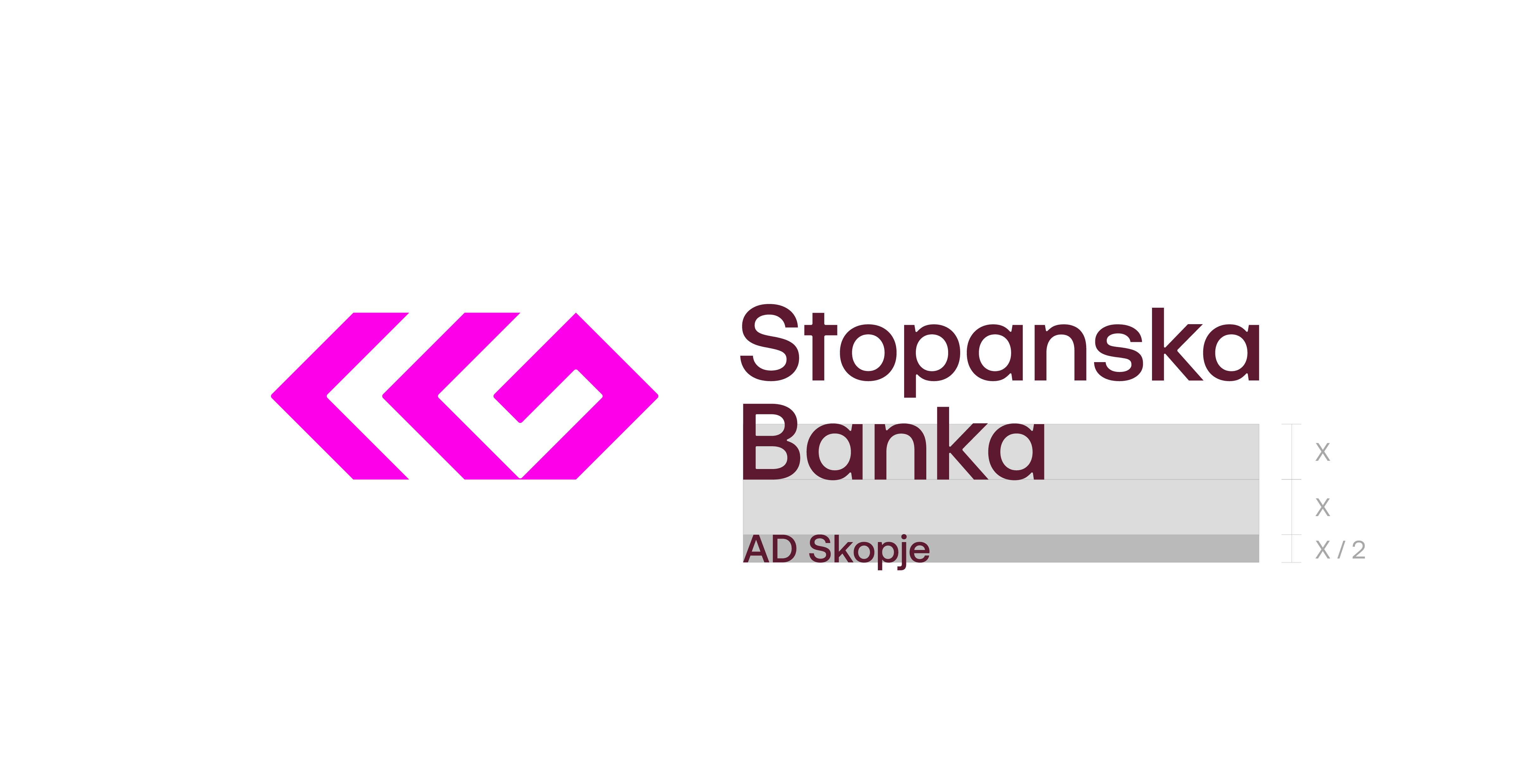
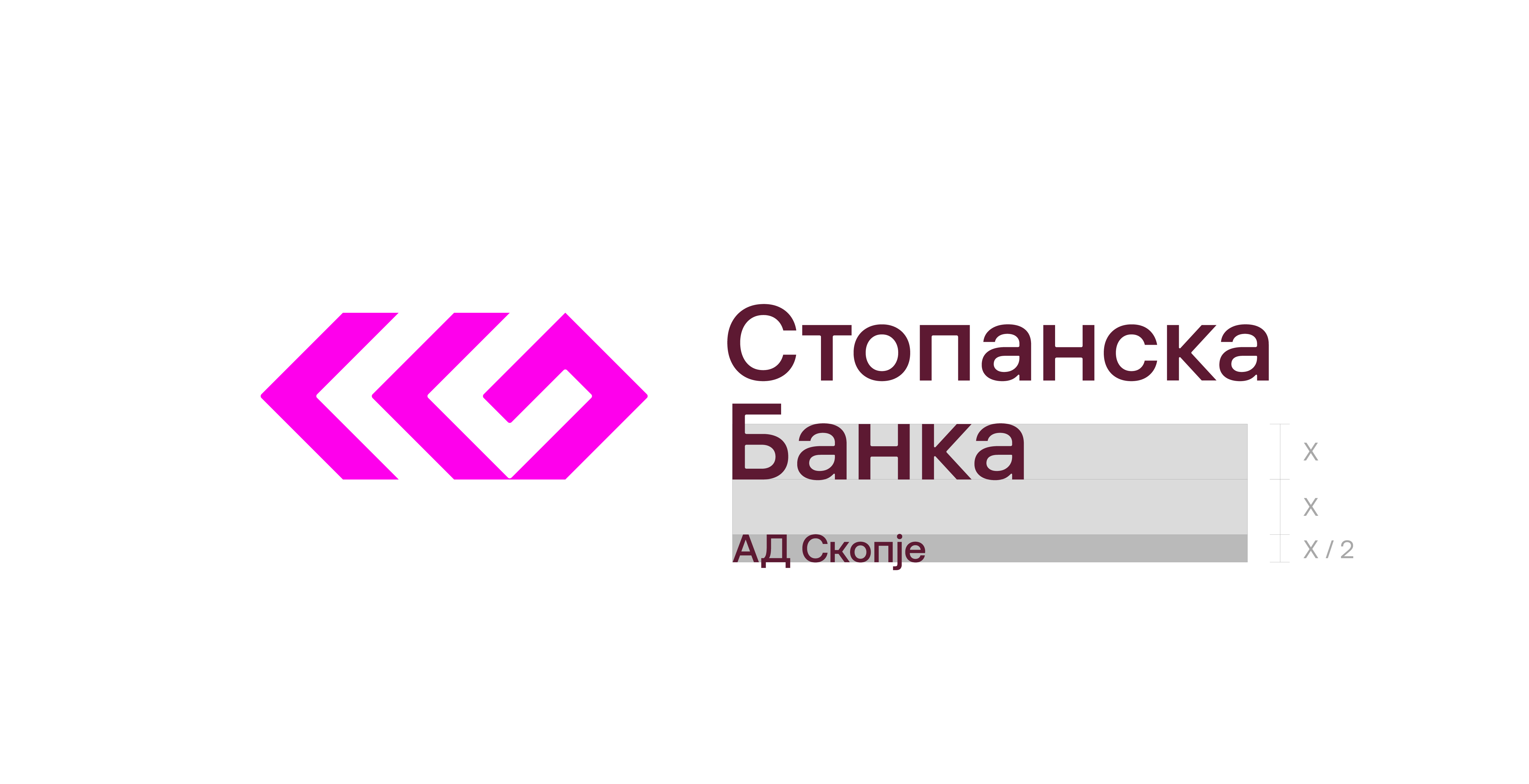
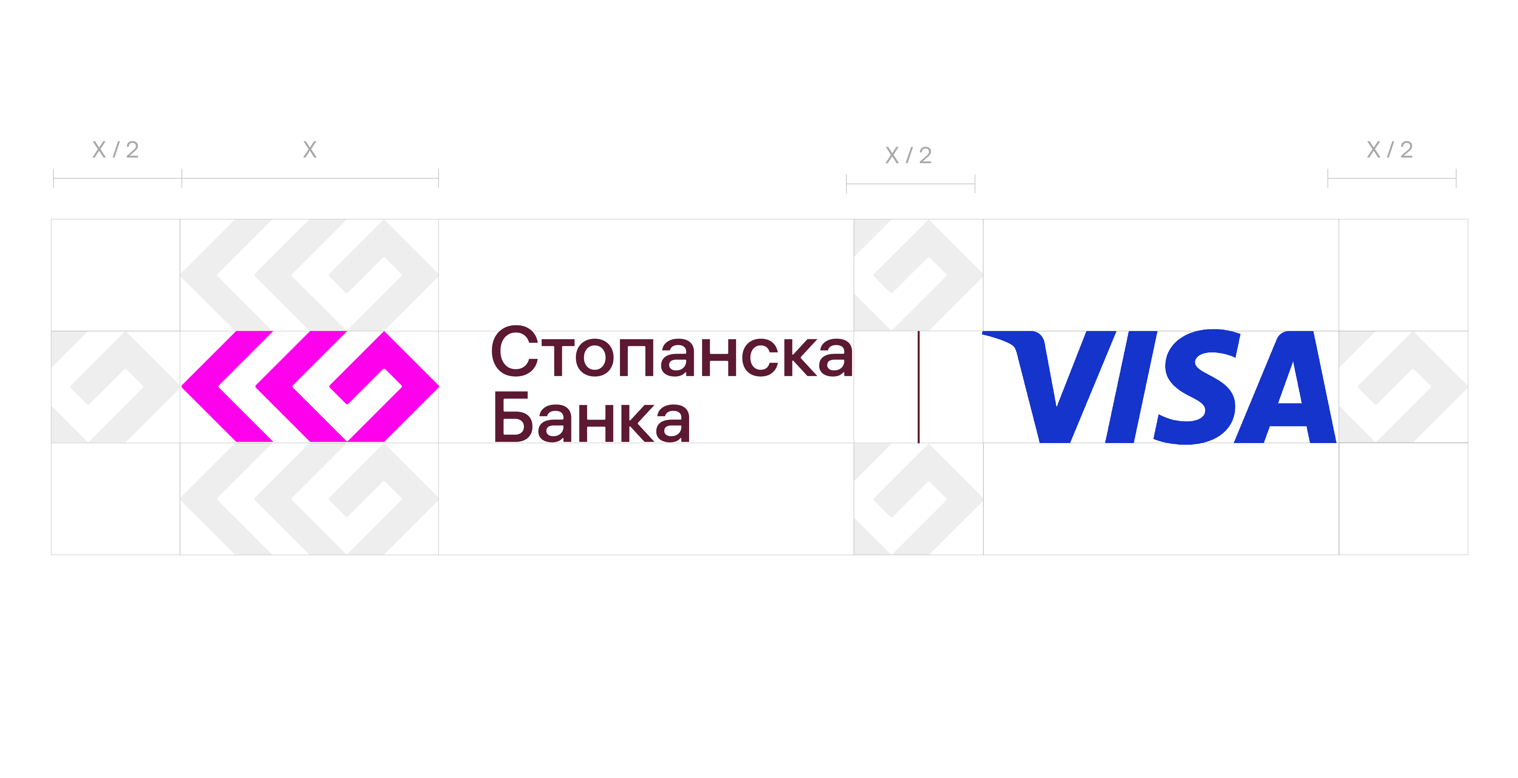
Clear space
To maintain the integrity and visual impact, the logotype must always be surrounded
by a minimum amount of clear space. This area should remain free of any other graphic elements, text, or distracting imagery.
Minimum size
The logotype must never be scaled down to a point where it loses its clarity.
When Stopanska Banka Logotype is too small, fine details disappear, and the brand’s
impact is weakened.
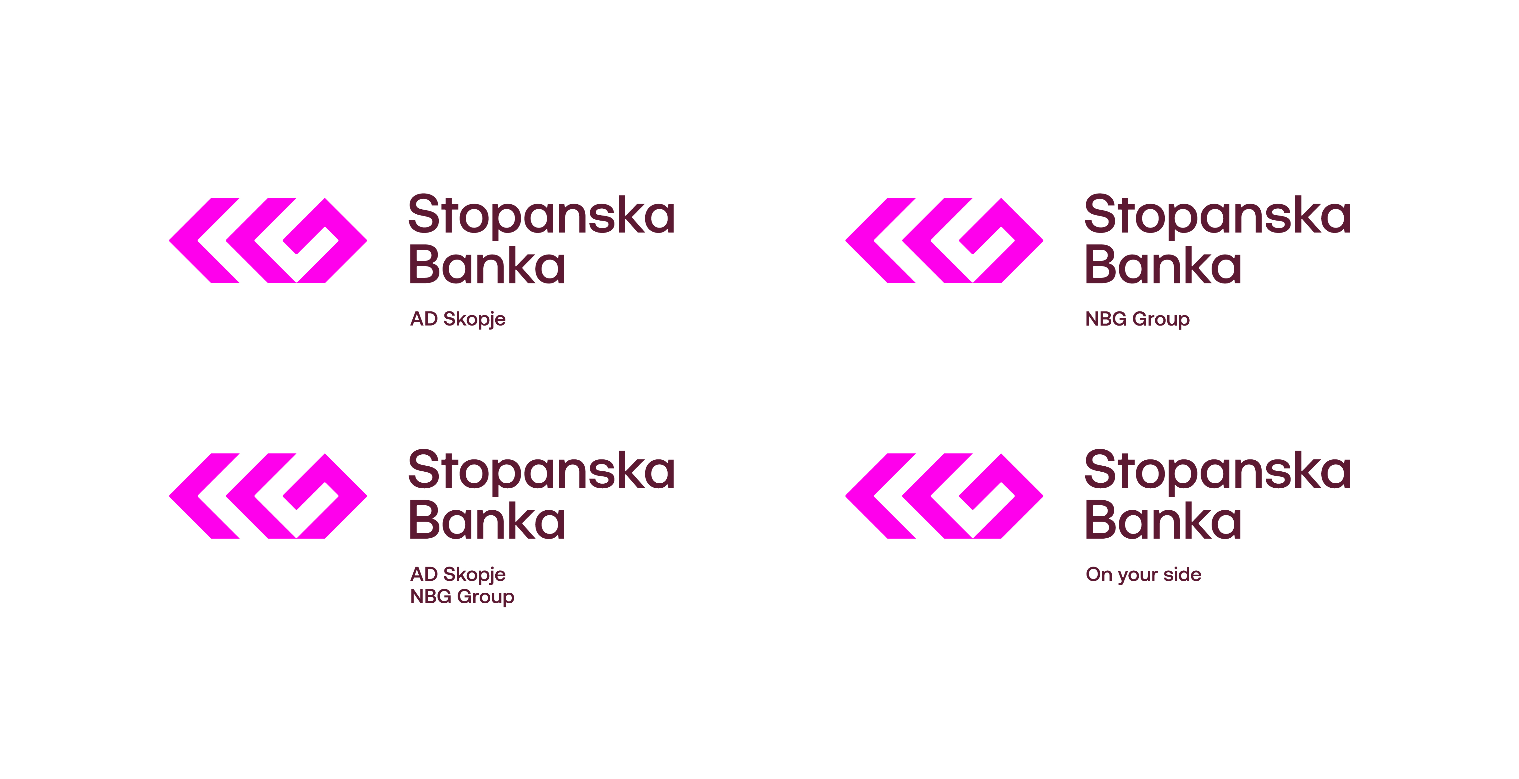
Logotype with taglines
When a tagline is applied, it must always follow the predefined layout rules.
The same structure can also be used to introduce additional taglines or short messages when needed.
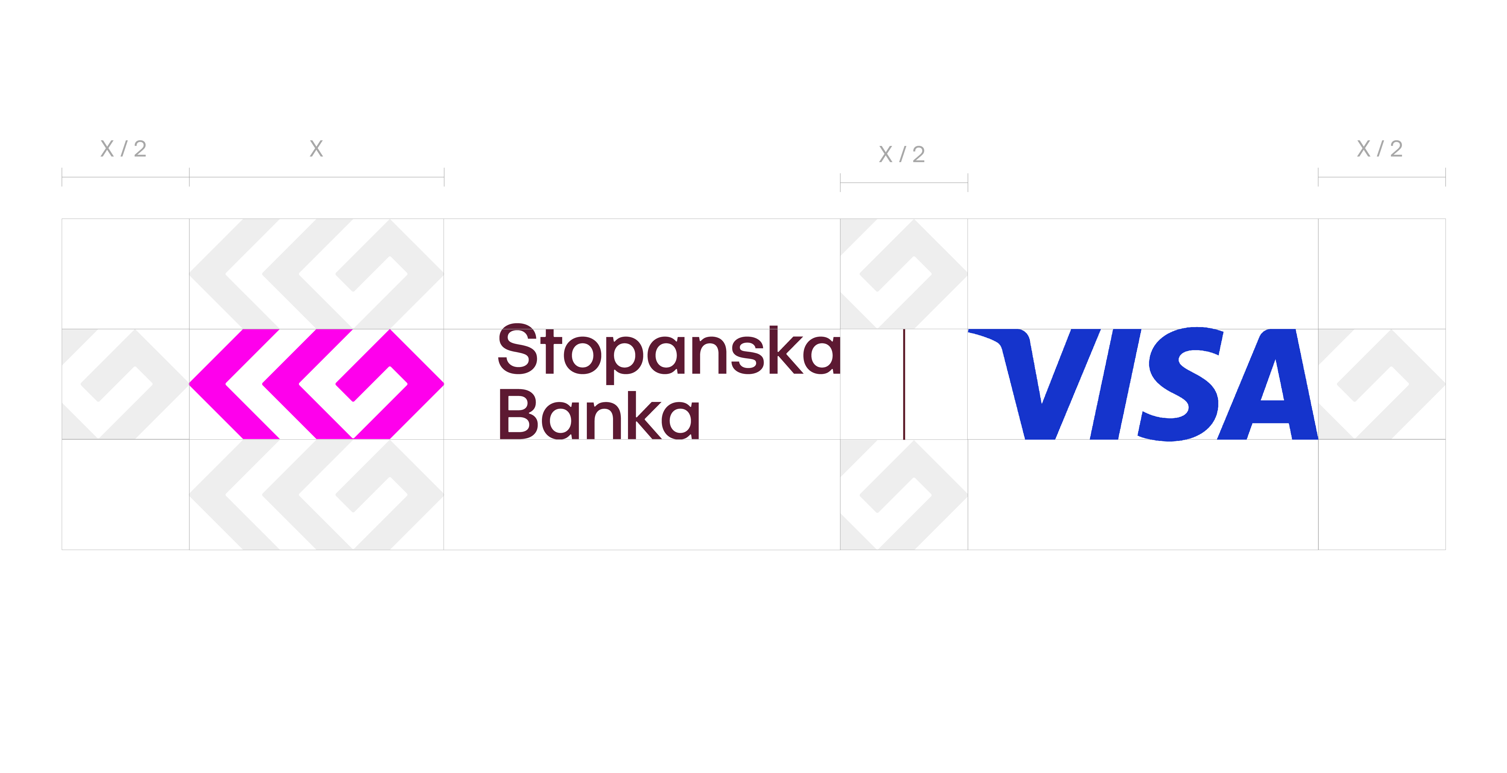
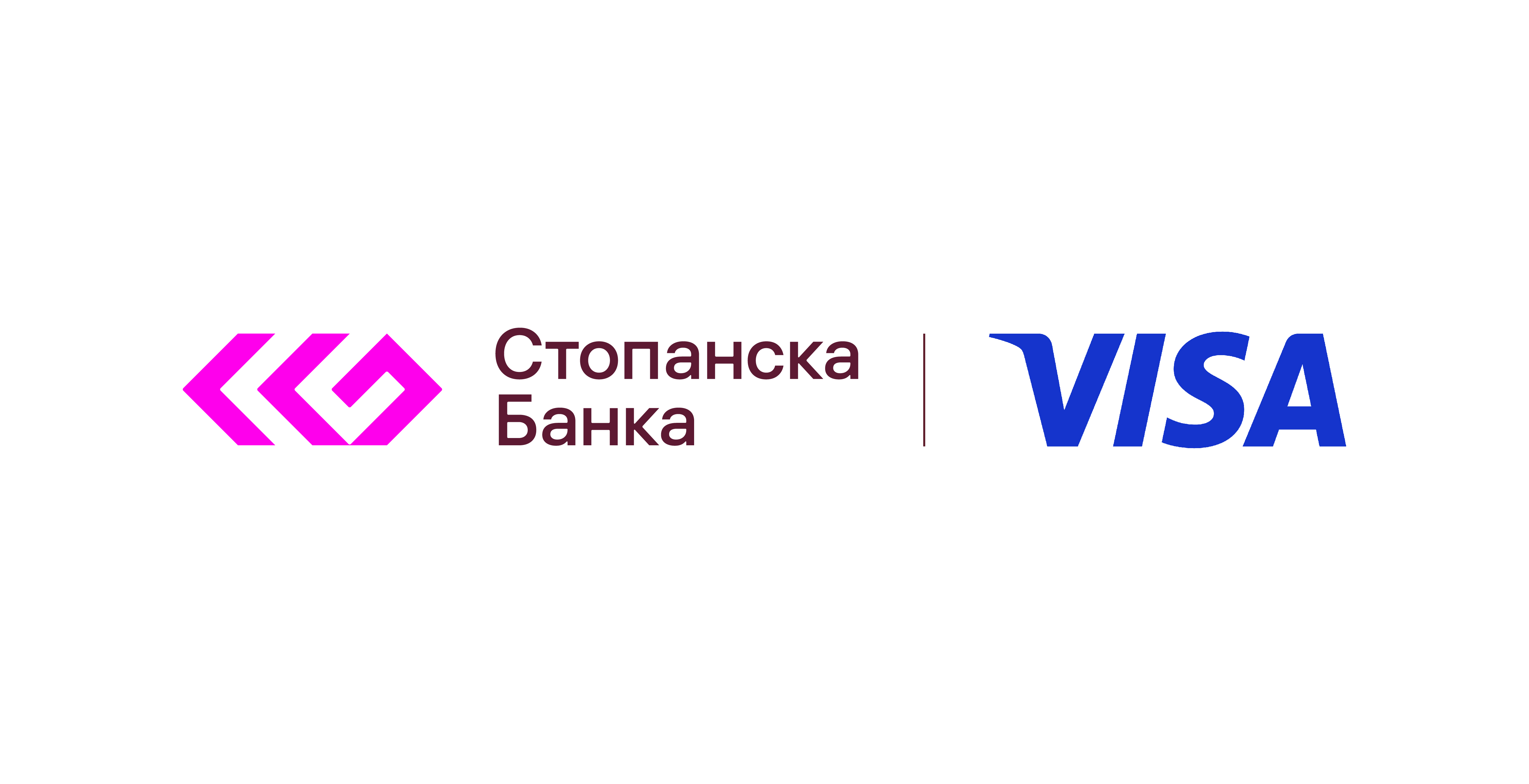
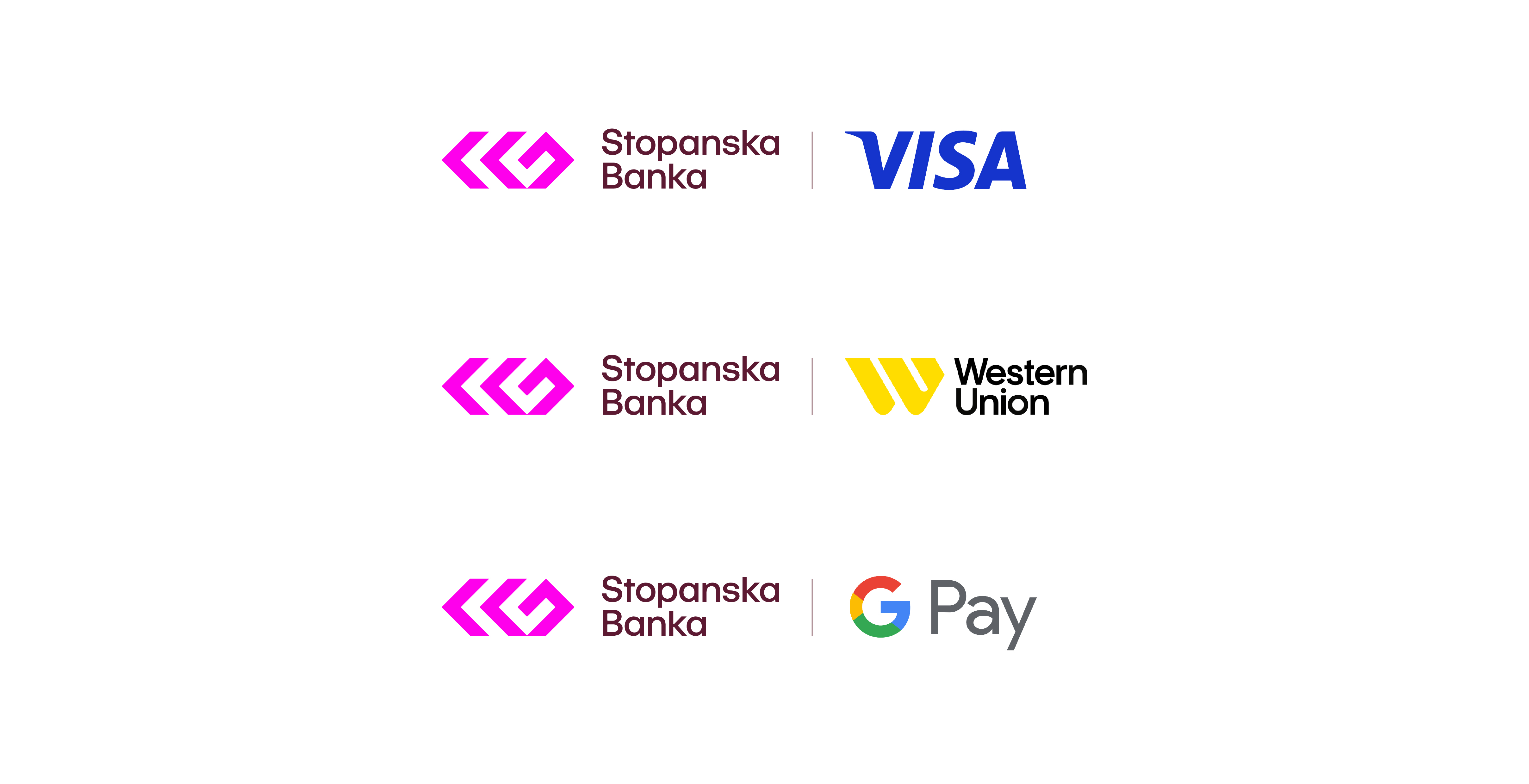
Partnerships / Lockups
All partnership and co-branding lockups must follow the approved compositions.

Horizontal Version (Exceptional Use Only)

Icon
Icon in use
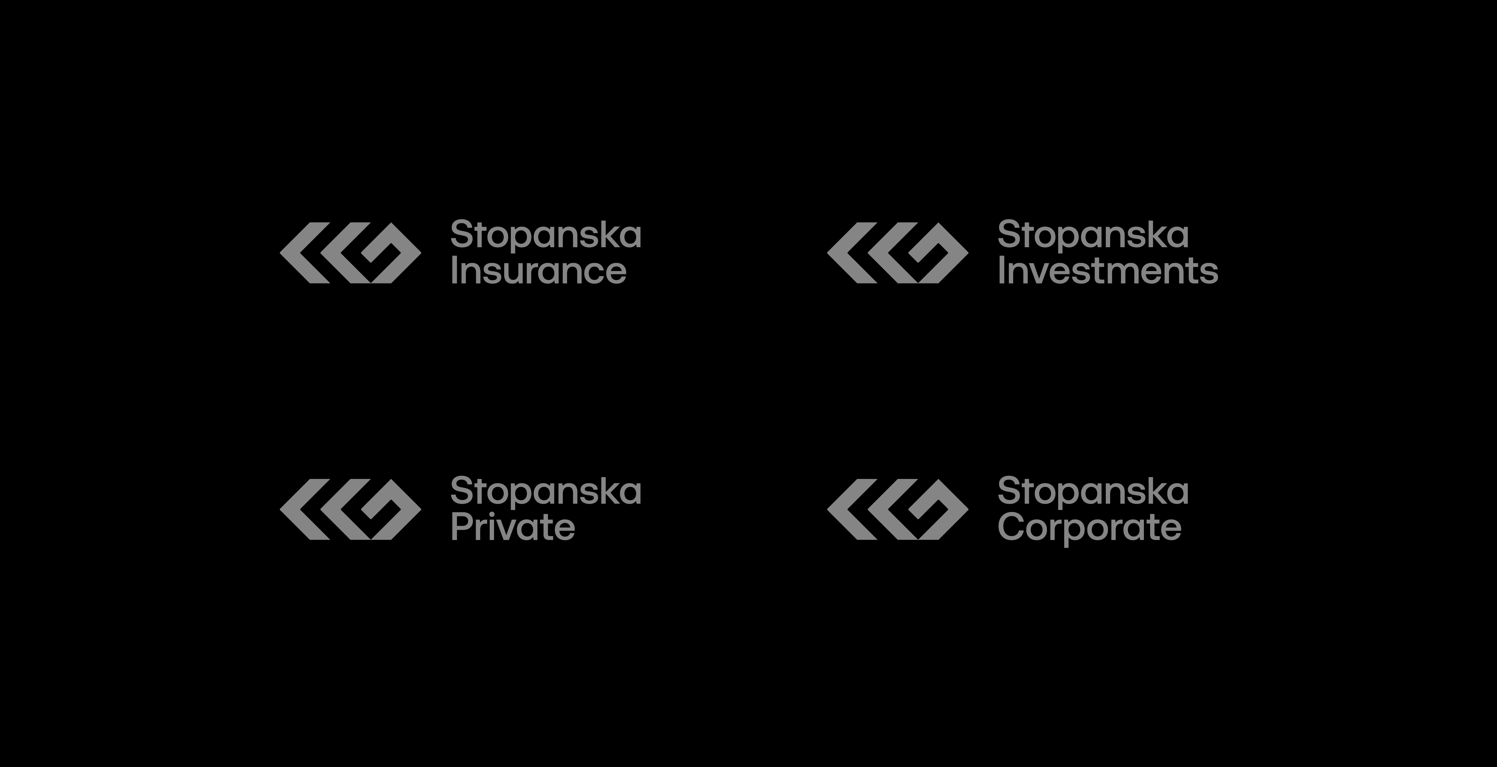
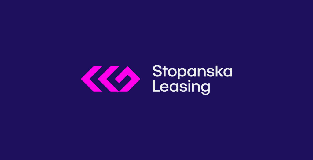
Business Units
Stopanska Leasing
Stopanska Leasing logos follow the same structural system as the primary logo.
They maintain the same proportions, typography, alignment rules, and overall
architecture, ensuring consistency across the brand ecosystem.

Stopanska Broker (Cyrillic Only)
Stopanska Broker logo, follows the same structural system as the primary logo.
They maintain the same proportions, typography, alignment rules, and overall
architecture, ensuring consistency across the brand ecosystem.

Stopanska Business Units Examples
By following the same architecture, proportions, typography, and spacing rules, new units can be seamlessly integrated into the brand ecosystem while maintaining visual consistency.